Getting Started
Gridlight apps are web applications that run inside the Gridlight desktop shell. They can be as simple as a single HTML file or as complex as a full-stack app with a backend server. The Gridlight platform gives your app instant access to local AI capabilities — LLMs, image generation, RAG, and memory — without any cloud dependencies.
You have three ways to build apps:
- App Builder — A visual, no-code builder for creating apps by dragging and dropping components
- New Dev App — Scaffold a new app from templates directly inside Gridlight
- Manual — Write your app from scratch using HTML, CSS, and JavaScript
Architecture Overview
Here's how the pieces fit together:
- Gridlight Desktop (Tauri) — The native shell that loads and displays your apps
- Gateway (Rust/Axum) — REST API on port 8080 that orchestrates all AI requests
- Agents — Specialized workers for inference, embeddings, reranking, and verification
- Your App — A web app (HTML/CSS/JS) rendered in a Tauri webview, calling the Gateway API
Apps don't need to bundle any AI models or ML libraries. They simply make HTTP calls to the local Gateway API, which handles all the heavy lifting.
Prerequisites
- Gridlight desktop app installed and running
- At least one AI model downloaded (for testing AI features)
# Check Node.js
node --version

# Check that Gridlight Gateway is running
curl http://localhost:8080/healthz
App Builder (No-Code)
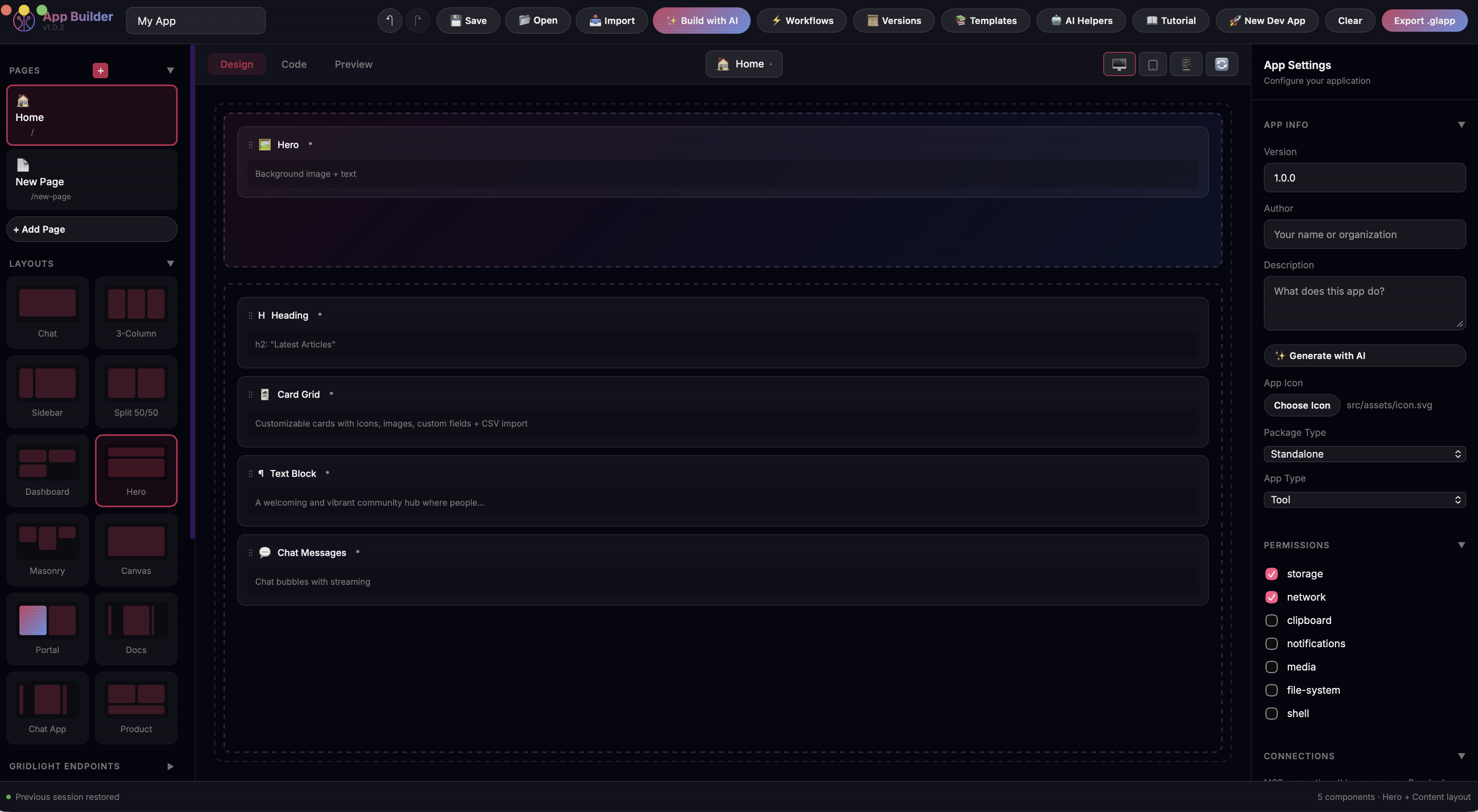
The fastest way to build a Gridlight app is with the visual App Builder. Open it in your browser, choose a layout, drag components onto the canvas, configure their properties, and export a ready-to-run app — no code required.
- 1
Open App Builder
Launch App Builder from within Gridlight — find it in your apps library and click to open.
- 2
Choose a layout
Pick a layout that matches your app's purpose:
- Chat — Messages panel, input area, sidebar
- Dashboard — Metrics, charts, data tables
- Sidebar — Navigation sidebar with main content area
- Split — Two-panel side-by-side layout
- Full Canvas — Freeform, flexible layout
- 3
Add components
Browse the component panel on the left. Drag components into the canvas zones. There are 56+ components across categories: forms, display, data visualization, AI-powered, navigation, and more.
- 4
Configure properties
Click any component to open its configuration panel on the right. Set labels, placeholder text, colors, data sources, and AI settings.
- 5
Preview and export
Preview your app in real time, then export it as a standalone HTML file or a .glapp package for distribution.
AI-Powered Building
The App Builder includes an AI assistant. Click "Build with AI" and describe what you want in plain language:
"Create a customer feedback form with a star rating,
comment box, email field, and a submit button that
saves responses to Gridlight."
The AI generates the full page layout with configured components. You can accept it as-is, regenerate, or fine-tune individual components.
Creating a New Dev App
The quickest way to scaffold a new app is right inside Gridlight. Click the "New Dev App" button in the Apps tab and Gridlight will generate a complete project template for you — ready to customize.
- 1
Open the Apps tab
In the Gridlight desktop app, navigate to the Apps tab.
- 2
Click "New Dev App"
You'll see a button to create a new developer app. Click it and give your app a name.
- 3
Choose a template
Pick a starting template that matches your app's purpose:
- Default — Basic starter with a heading and text
- Chat — Chat interface with messages panel and input
- Dashboard — Metrics, cards, and data display
- 4
Select a theme and layout
Customize the look and structure:
Option Choices Theme Gridlight (dark), Midnight (deep purple), Modern (light), Minimal (B&W) Layout Chat, Dashboard, Sidebar, Split, Full Canvas - 5
Start building
Gridlight creates the project with the right file structure and opens it for you. You'll get a
gridlight.jsonmanifest, anapp.jsonconfiguration, and an HTML entry point — everything you need to start customizing.
Your new app will have this structure:
my-app/
├── gridlight.json       # App manifest (name, version, entry point)
├── src/
│   ├── app.json         # App configuration (layout, components, zones)
│   └── index.html       # Entry point
└── README.md
Building Apps with Code
For maximum control, build your app from scratch. You just need two files: agridlight.json manifest and an HTML entry point.
{
  "name": "My Custom App",
  "version": "1.0.0",
  "short_description": "A custom AI-powered application",
  "detailed_description": "A full description of what this app does and its features.",
  "usage_instructions": "Describe how to use the app here.",
  "author": "Your Name",
  "icon": "src/assets/icon.png",
  "entry": "src/index.html",
  "runtime": "1.0",
  "type": "standalone",
  "gridlight_version_required": "0.6.0",
  "permissions": ["network", "storage"],
  "dependencies": {
    "components": [],
    "themes": []
  },
  "build": {
    "target": "single-html",
    "minify": true
  },
  "window": {
    "width": 1200,
    "height": 800
  }
}<!DOCTYPE html>
<html lang="en">
<head>
<meta charset="UTF-8">
<title>My Custom App</title>
<style>
body { font-family: system-ui; background: #0f0f23; color: #fff; }
</style>
</head>
<body>
<h1>Hello, Gridlight!</h1>
<button onclick="askAI()">Ask AI</button>
<div id="response"></div>
<script>
async function askAI() {
const res = await fetch('http://localhost:8080/neon', {
method: 'POST',
headers: {
'Content-Type': 'application/json',
'Authorization': 'Bearer dev-token'
},
body: JSON.stringify({
question: 'What is Gridlight?',
stream: false
})
});
const data = await res.json();
document.getElementById('response').textContent = data.answer;
}
</script>
</body>
</html>You can use any frontend framework you like — React, Vue, Svelte, or vanilla JS. As long as you have a gridlight.json and an HTML entry point, Gridlight will load it.
For hybrid apps with a backend server, add a backend section to your manifest:
{
  "name": "My Hybrid App",
  "version": "1.0.0",
  "short_description": "An app with a backend server",
  "author": "Your Name",
  "icon": "frontend/assets/icon.png",
  "entry": "frontend/index.html",
  "runtime": "1.0",
  "type": "hybrid",
  "gridlight_version_required": "0.6.0",
  "backend": {
    "entry": "backend/server.js",
    "port": 3002,
    "install": "npm install",
    "healthCheck": "/api/health"
  },
  "permissions": ["network", "storage"],
  "dependencies": {
    "components": [],
    "themes": []
  },
  "build": {
    "target": "hybrid-app",
    "minify": true
  },
  "window": {
    "width": 1200,
    "height": 800
  }
}
Manifest Field Reference
| Field | Required | Type | Description |
|---|---|---|---|
name | Yes | string | Display name shown in the app launcher and marketplace. Keep it short and descriptive. |
version | Yes | string | Semantic version (e.g. "1.0.0"). Bump this each time you publish an update. |
short_description | Yes* | string | 1-2 sentence summary displayed on the app card in the marketplace. Required for publishing. |
detailed_description | No | string | Full description shown on the app details page. List features and capabilities here. |
usage_instructions | No | string | Step-by-step instructions for using the app. Shown in the help/info panel. |
author | Yes* | string | Author or organization name. Displayed on the app card. Required for publishing. |
icon | Yes* | string | Relative path to the app icon (SVG or PNG). Used in the launcher and marketplace. Required for publishing. |
entry | Yes | string | Relative path to the HTML entry point. For standalone apps use src/index.html, for hybrid apps use frontend/index.html. |
runtime | Yes | string | Gridlight runtime version. Use "1.0" for all current apps. |
type | Yes | string | "standalone" for frontend-only apps. "hybrid" for apps that include a backend server. |
gridlight_version_required | No | string | Minimum Gridlight desktop version needed to run the app (e.g. "0.6.0"). Users on older versions will see an upgrade prompt. |
permissions | No | array | System capabilities the app needs. Values: "network", "storage", "clipboard", "filesystem", "camera", "location", "notifications", "shell". |
dependencies | No | object | Declares component, theme, and external library dependencies. Keys: components (array), themes (array), external (array of library names, e.g. "chart.js", "fflate@0.8.2"). |
build | No | object | Build configuration. target: "single-html", "hybrid-app", "pwa", or "docker". minify: boolean to minify output. |
window | No | object | Window size and behavior. Keys: width, height (pixels), minWidth, minHeight, maxWidth, maxHeight, resizable (boolean), maximized (boolean), fullscreen (boolean). |
backend | Hybrid only | object | Backend server config. entry: JS file to run with Node. port (required): port to listen on. install: dependency install command. healthCheck: health endpoint path. |
connections | No | array | MCP connections the app uses. Each entry has id ("filesystem", "fetch-web", "github") and required (boolean). |
Fields marked Yes* are technically optional for local development, but required when publishing to the Gridlight Marketplace. Fill them in before exporting your .glapp package.
Recommended Project Structure
Follow these conventions to keep your project clean and ready for marketplace publishing.
Standalone App
my-app/
├── gridlight.json          # App manifest
├── src/
│   ├── index.html          # Entry point
│   ├── app.json            # App config (settings, theme, layout)
│   ├── assets/
│   │   ├── icon.svg        # App icon (SVG recommended)
│   │   └── logo.png        # Logo or branding assets
│   ├── css/
│   │   └── styles.css      # Stylesheets
│   └── js/
│       └── app.js          # Application logic
├── scripts/
│   └── package-glapp.js    # Build script for .glapp export
├── dist/                   # Build output
│   └── my-app-1.0.0.glapp  # Packaged app for marketplace
└── tests/ # Test files- Keep
gridlight.jsonat the project root — Gridlight looks for it there. - Use
src/for all source files to keep the root directory clean. - Use SVG for your app icon — it scales to any size in the marketplace and app launcher.
- Build output goes to
dist/. Your.glapppackage is generated there.
Hybrid App (with Backend)
my-hybrid-app/
├── gridlight.json          # App manifest (type: "hybrid")
├── frontend/
│   ├── index.html          # Frontend entry point
│   ├── assets/
│   │   └── icon.svg
│   ├── css/
│   │   └── theme.css
│   └── js/
│       └── app.js
├── backend/
│   ├── server.js           # Backend entry point (Express, etc.)
│   ├── package.json        # Backend dependencies
│   ├── routes/             # API route handlers
│   │   ├── health.js
│   │   └── api.js
│   ├── services/           # Business logic
│   │   └── myService.js
│   └── db/                 # Database files (if using SQLite)
│       ├── schema.sql
│       └── init.js
├── dist/                   # Build output
│   └── my-hybrid-app-1.0.0.glapp
└── tests/- Separate
frontend/andbackend/directories clearly. - Your backend
server.jsshould listen on the port specified ingridlight.json. - Always provide a health check endpoint (e.g.
/api/health) so Gridlight can verify the backend is running. - Put
package.jsonin the backend directory and set"install": "npm install"in the manifest so dependencies are installed automatically. - Use
routes/for API endpoints andservices/for business logic. - For SQLite databases, store files in
backend/db/.
Enabling Dragging App Window
For app developers building Gridlight marketplace apps, the only thing needed is to add data-tauri-drag-region to your header element:
<header class="header" data-tauri-drag-region>
    <span>My App Name</span>
    <button>Settings</button>  <!-- buttons still work normally -->
</header>
That's it. Gridlight automatically detects:
- Any element with
data-tauri-drag-regionattribute - Any
<header>element - Any element with class
header
So if your app already has a <header> tag or a .header class on your top bar, dragging works automatically with no changes.
Interactive children (buttons, inputs, links, selects) are automatically excluded from the drag behavior.
Component Library
Gridlight provides 56 modular UI components you can use in your apps. Each component has configurable properties, built-in styling, and JavaScript logic. When using the App Builder or the app.json configuration, you reference these by type name.
Endpoint Components
These components connect directly to Gridlight's AI APIs:
| Component | Description | How to Use |
|---|---|---|
| Neon Query | Send RAG-powered queries to the /neon endpoint with streaming support | Set type: "neon-query". Configure domain to filter by knowledge base and limit for max results. Bind a text input to feed the query. |
| Intelligent Chat | Multi-turn conversational AI via /chat/intelligent | Set type: "intelligent-mode". Pair with a Chat Messages display component to show the conversation thread. Supports streaming responses. |
| Image Generation | Generate images from text prompts, transform existing images, or inpaint regions via /image | Set type: "image-gen". Configure width, height, steps, and cfg_scale. Supports text-to-image, image-to-image, and inpainting modes. |
| File Upload | Upload documents for training and indexing via /upload-structured (or /upload-async for large files) | Set type: "file-upload". Sends multipart/form-data with a file part and a metadata JSON part. Supports Excel/PDF/CSV parsing out of the box. Uploaded files are chunked and indexed into the knowledge base automatically. |
| Text Train | Send raw text records for training via /train | Set type: "train". Connect a textarea or text block as the input source. Posts a typed record ({ "type": "text_chunk", "text": "...", "payload": { "domain": "..." } }) to add custom knowledge without file uploads. |
Display Components
Components for rendering content and showing status:
| Component | Description | How to Use |
|---|---|---|
| Response Display | Renders AI responses with markdown formatting, source citations, and a copy button | Set type: "response-display". Includes a built-in thinking indicator while waiting for responses. Bind to a Neon Query or Intelligent Chat component. |
| Chat Messages | Conversation thread with user/AI message bubbles and streaming support | Set type: "chat-messages". Configure userBubbleColor to match your theme. Supports timestamps and streaming token display. |
| Status Badge | Connection and system status pill indicator | Set type: "status-badge". Automatically shows connected, error, or pending states based on the gateway connection. |
| List | Customizable list with icons and CSV import support | Set type: "list-component". Configure items with icons and labels. Supports importing data from CSV files. |
| Card Grid | Grid of customizable cards with images, icons, and configurable fields | Set type: "card-grid". Configure columns, showImage, showIcon, and define custom fields as a JSON array. Supports CSV import. |
Form Components
Input components for collecting user data. All form components support storageKey for persisting values across sessions.
| Component | Description | How to Use |
|---|---|---|
| Auto Textarea | Expanding text input that grows with content | Set type: "auto-textarea". Configure minHeight and maxHeight to control sizing. Enable submitOnEnter to trigger actions on Enter key. |
| Input + Send | Text input with an action button for submitting queries | Set type: "input-send". Configure placeholder and buttonText. Add customJs to run logic on submit. |
| Dropdown | Select from a list of options | Set type: "dropdown-select". Provide options as a JSON array. Set a label and placeholder for context. |
| Checkbox Group | Multi-select checkboxes in a grid layout | Set type: "checkbox-group". Provide options as a JSON array. Use columns to control the grid layout (e.g., 2 or 3 columns). |
| Chip Buttons | Clickable tag buttons for quick selections | Set type: "chip-buttons". Provide chips as a JSON array. Enable multiSelect to allow selecting more than one chip. |
| Quick Actions | Preset prompt buttons arranged in a grid | Set type: "quick-actions". Define buttons as a JSON array with labels and prompts. Set columns for grid layout. |
| Search with Filters | Search input with filter chips and Gridlight integration | Set type: "search-filters". Configure filters as JSON, set domain and limit to control search scope. |
| Login Form | Email/password login with optional OAuth buttons | Set type: "login-form". Enable showOAuth and provide oauthProviders as JSON. Set loginEndpoint for your backend. |
| Signup Form | User registration with configurable password rules | Set type: "signup-form". Configure password requirements: minPasswordLength, requireUppercase, requireNumber, requireSpecial. |
| Password Reset | Password reset request form | Set type: "password-reset". Customize title, subtitle, and buttonText to match your app's branding. |
AI-Powered Components
Specialized AI components that add intelligence to your apps with zero configuration:
| Component | Description | How to Use |
|---|---|---|
| AI Content Generator | Generate text content with customizable tone and style | Set type: "ai-content-generator". Provide a prompt template and configure output tone. Useful for generating descriptions, summaries, or marketing copy. |
| AI Chat Widget | Floating chat bubble for any page — like an AI support agent | Set type: "ai-chat-widget". Drop it onto any page for an instant AI assistant. It floats in the corner and expands on click. |
| Smart Search | Semantic search with relevance scoring and source citations | Set type: "smart-search". Returns results ranked by semantic relevance rather than keyword matching. Shows source citations for transparency. |
| AI Summary Card | Automatically summarize documents or long text | Set type: "ai-summary-card". Bind it to a data source or document upload. Generates concise summaries automatically. |
| Document Q&A | Upload a document and ask questions about it | Set type: "document-qa". Combines a file upload zone with a query input. Users upload a document, then ask natural-language questions about its content. |
| AI Form Filler | Extract structured data from unstructured documents | Set type: "ai-form-filler". Define the target fields and the AI will parse uploaded documents to fill them automatically. |
| AI Data Insights | Auto-analyze datasets, detect trends, and generate visualizations | Set type: "ai-data-insights". Point it at a data source and it will identify patterns, anomalies, and trends — then render charts automatically. |
Data & Visualization Components
Components for building dashboards and displaying structured data:
| Component | Description | How to Use |
|---|---|---|
| Data Loader | Fetch structured data from Gridlight and store it in a variable | Set type: "data-loader". Configure query, domain, and limit. Set variable_name to make the data available to other components via data binding. |
| Metric Card | Display a single metric with a change indicator | Set type: "metric-card". Configure label, default_value, and change_type (positive, negative, or neutral). Bind to a data source with data_source and value_path. |
| Bar Chart | Interactive bar chart for comparing categories | Set type: "bar-chart". Configure data_source, label_key, and value_key to map your data fields. Set dataset_label for the legend. |
| Line Chart | Interactive line chart for trend analysis over time | Set type: "line-chart". Same configuration as Bar Chart — set data_source, label_key, and value_key. Ideal for time-series data. |
| Pie Chart | Pie or doughnut chart for showing distribution | Set type: "pie-chart". Configure data_source, label_key, and value_key. Colors are assigned automatically. |
| Data Table | Sortable table for displaying tabular data | Set type: "data-table". Set data_source to point at a Data Loader variable. Columns are generated automatically from the data structure. |
Layout & Container Components
Structural components for organizing your app's interface:
| Component | Description | How to Use |
|---|---|---|
| Tabs | Container with switchable tab panels | Set type: "tabs-component". Define tabs as a JSON array with labels. Set defaultTab to control which tab opens first. Drop other components into each tab panel. |
| Accordion | Collapsible sections for organizing content | Set type: "accordion-component". Define sections as a JSON array. Set allowMultiple: true to let users expand more than one section at a time. |
| Modal | Popup dialog with a trigger button and droppable content area | Set type: "modal-dialog". Configure triggerText, title, and size (sm, md, or lg). Place other components inside the modal body. |
| Grid Container | CSS Grid layout container for arranging components | Set type: "grid-container". Configure columns, rows, and gap (0, 8, 16, 24, or 32px). Nest child components inside for structured layouts. |
App Manifest Specification
Every Gridlight app needs a gridlight.json file at the project root. This is how Gridlight discovers and loads your app.
Required Fields
| Field | Type | Description |
|---|---|---|
name | string | Display name of your app |
version | string | Semantic version (e.g. "1.0.0") |
entry | string | Path to the HTML entry point |
runtime | string | Gridlight runtime version (use "1.0") |
type | string | "standalone" or "hybrid" (with backend) |
Optional Fields
| Field | Type | Description |
|---|---|---|
short_description | string | 1-2 sentence summary for the app card |
detailed_description | string | Full description for the app details page |
usage_instructions | string | How to use the app, shown in help/info panel |
author | string | Author or organization name |
icon | string | Path to app icon (SVG or PNG recommended) |
gridlight_version_required | string | Minimum Gridlight version needed (e.g. "0.6.0") |
app_type | string | Category: "tool", "viewer", "editor", or "dashboard" |
permissions | array | Requested permissions (see Permissions below) |
dependencies | object | Component, theme, and external library dependencies |
build | object | Build configuration (target and minify) |
connections | array | MCP connection declarations |
window | object | Window size and behavior settings |
backend | object | Backend server config (required for hybrid apps) |
Permissions
The permissions array declares what system capabilities your app needs.
| Permission | Description |
|---|---|
"network" | Make HTTP requests to external servers |
"storage" | Store data locally (IndexedDB / localStorage) |
"clipboard" | Read and write to the clipboard |
"filesystem" | Read/write local files (prompts the user for access) |
"camera" | Access camera or microphone |
"location" | Access geolocation |
"notifications" | Show system notifications |
"shell" | Execute system commands (prompts the user for access) |
Window Object
Controls the initial window size and behavior when the app launches.
| Field | Type | Default | Description |
|---|---|---|---|
width | number | 1500 | Initial width in pixels |
height | number | 875 | Initial height in pixels |
minWidth / minHeight | number | — | Minimum dimensions |
maxWidth / maxHeight | number | — | Maximum dimensions |
resizable | boolean | true | Allow the user to resize the window |
maximized | boolean | false | Start maximized (fills screen, keeps taskbar) |
fullscreen | boolean | false | Start in true fullscreen (hides taskbar) |
Priority: fullscreen > maximized > width/height. If maximized is true, explicit width/height are ignored.
Dependencies Object
"dependencies": {
  "components": [],
  "themes": ["gridlight"],
  "external": ["chart.js", "katex"]
}| Field | Type | Description |
|---|---|---|
components | array | Custom component names your app depends on |
themes | array | Theme names (e.g. "gridlight", "arcade") |
external | array | External libraries with optional versions (e.g. "fflate@0.8.2") |
Build Object
"build": {
  "target": "single-html",
  "minify": true
}| Field | Type | Description |
|---|---|---|
target | string | "single-html", "hybrid-app", "pwa", or "docker" |
minify | boolean | Whether to minify the build output |
Backend Object (Hybrid Apps)
Required when type is "hybrid". Configures the backend server that Gridlight starts alongside your frontend.
| Field | Type | Required | Description |
|---|---|---|---|
entry | string | * | JS file to run with Node (e.g. "backend/server.js") |
command | string | * | Shell command to start the backend (e.g. "npm start") |
path | string | No | Working directory for the command (relative to app root) |
port | number | Yes | Port the backend listens on |
install | string | No | Dependency install command (e.g. "npm install") |
healthCheck | string | No | Health check endpoint path (e.g. "/api/health") |
Provide either entry or command, not both. With entry, Gridlight runs node <entry> from the app root. With command, Gridlight runs it as a shell process from the path directory.
Connections Array
Declare MCP (Model Context Protocol) connections your app can use.
"connections": [
  { "id": "filesystem", "required": true },
  { "id": "fetch-web", "required": false },
  { "id": "github", "required": false }
]| Connection ID | Description |
|---|---|
filesystem | Read/write files on the local filesystem |
fetch-web | Make HTTP requests to external URLs |
github | GitHub API access (repos, issues, PRs) |
Data Binding & State
When building apps with the App Builder or app.json, you can connect components together using data bindings. Changes to one component automatically update any bound components.
{
  "bindings": [
    {
      "source": "search-input",
      "sourceProperty": "value",
      "target": "results-display",
      "targetProperty": "query"
    }
  ]
}
In exported apps, you can use the runtime API:
// Set a value
window.AppBindings.setValue('global.username', 'Jane');

// Get a value
const name = window.AppBindings.getValue('global.username');

// React to changes
window.AppBindings.onChange('global.username', (newValue) => {
  console.log('Username changed to:', newValue);
});
Workflows & Automation
Workflows let you automate multi-step processes in your apps — from simple "on form submit, show notification" to complex chains with conditional branching and API calls.
App Builder Workflows
In the App Builder, workflows are defined visually. Define triggers (what starts the workflow) and actions (what happens):
| Triggers | Actions |
|---|---|
| Form Submitted | Show Notification (toast message) |
| Button Clicked | Navigate to URL |
| Page Loaded | Set Value (update variable) |
| Data Changed | Show/Hide Component |
| Component Value Changes | Call API / Save to Gridlight |
| Webhook Received | Run Custom Code (JavaScript) |
| Scheduled (Cron) | HTTP Request, If/Else, Loop, Wait/Delay |
{
  "workflows": [
    {
      "name": "Submit Feedback",
      "trigger": { "type": "form_submitted", "source": "feedback-form" },
      "actions": [
        {
          "type": "api_call",
          "url": "http://localhost:8080/train",
          "method": "POST",
          "body": {
            "type": "text_chunk",
            "text": "{{feedback-form.value}}",
            "payload": { "domain": "feedback" }
          }
        },
        {
          "type": "show_notification",
          "message": "Thank you for your feedback!",
          "variant": "success"
        }
      ]
    }
  ]
}
Themes & Styling
Gridlight apps support built-in themes and fully custom styling. Themes control colors, fonts, spacing, and component appearance.
Built-in Themes
| Theme | Style |
|---|---|
| Gridlight | Dark with pink/purple accents (default) |
| Midnight | Deep blue-black with cool tones |
| Modern | Clean, minimal dark theme |
| Minimal | Light theme with subtle colors |
| Neon | Vibrant neon colors on dark background |
| Ocean | Blue-green oceanic palette |
| Forest | Earthy green tones |
| Sunset | Warm orange and red gradient |
| Elegant | Sophisticated dark with gold accents |
| Rose | Soft pink and rose tones |
Custom Themes
Create your own theme by setting CSS custom properties:
{
  "theme": {
    "preset": "custom",
    "primary": "#e91e63",
    "secondary": "#2196f3",
    "background": "#0f0f23",
    "surface": "rgba(26, 26, 46, 0.8)",
    "text": "#ffffff",
    "textMuted": "#888888",
    "accent": "#a855f7",
    "fontFamily": "Inter",
    "customFontUrl": "https://fonts.googleapis.com/css2?family=Inter:wght@400;500;600;700"
  }
}
Export & Publishing
Once your app is ready, export it in the format that fits your needs.
HTML Export
Export as a single HTML file — perfect for quick sharing or embedding. Everything (styles, scripts, components) is bundled into one file.
.glapp Package
The native Gridlight package format for desktop distribution. This is what you need to publish to the marketplace.
npm run build      # Compile your app
npm run package    # Create .glapp file
The .glapp file contains your manifest, compiled app, and runtime. Users install it by downloading and placing it in their ~/Gridlight/apps/ directory.
PWA Export
You can also export as a Progressive Web App with a manifest and service worker for installable, offline-capable deployments.
Publishing to Marketplace
- 1
Build your .glapp package
Run
npm run packageto create the distributable file. - 2
Create a marketplace listing
Visit market.gridlight.ai, create an account, and submit your app with screenshots, description, pricing, and categories.
- 3
Set pricing
Choose free or paid distribution. Paid apps use Stripe for secure payments. Bundle discounts are automatically applied for multi-app purchases from the same seller.
- 4
Publish
Submit for review. Once approved, your app is live in the marketplace for all Gridlight users to discover.
Include clear usage instructions and screenshots in your listing. Apps with good documentation get significantly more downloads.
API Reference
All API requests go to the Gridlight Gateway, a Rust/Axum HTTP service. The desktop app bundles and launches the gateway automatically when you press Start, so it's available whenever Gridlight is running. Everything below is a direct HTTP call — no SDK required.
If you're building apps with App Builder, you don't need to call these APIs directly — the components handle all API communication automatically. This section is for reference if you're building a custom application, a hybrid-app backend, or integrating Gridlight from an external tool.
Connection & Authentication
| Base URL | http://localhost:8080 — the gateway binds 0.0.0.0:8080, so it's also reachable across your LAN (e.g. http://192.168.1.50:8080), which is how Grid workers reach the head node. |
| Auth | Send Authorization: Bearer <token>. The default development token is dev-token; override it by setting the GATEWAY_TOKEN environment variable. Authentication is enforced per endpoint — most data endpoints require the header; health and discovery endpoints are open. |
| Content type | application/json for JSON endpoints, multipart/form-data for file uploads. The maximum request body is 100 MB. |
| Health check | GET /healthz (alias GET /health) returns status, license state, system TFLOPs, and chat capabilities. GET /VERSION returns the plain-text version, and GET /features lists enabled features. |
| App server | A separate static/hybrid app host runs on port 8090. It serves installed Gridlight apps and reverse-proxies hybrid-app backends — it is not part of the AI API surface below. |
curl -X POST http://localhost:8080/neon \
  -H "Authorization: Bearer dev-token" \
  -H "Content-Type: application/json" \
-d '{ "question": "What is Gridlight?", "stream": false }'When no license is installed, the gateway runs in an open mode and /healthz reports "status": "open". With a license, core endpoints record usage against your TFLOP allocation.
RAG & Query
Gridlight exposes several query endpoints, from raw vector search up to full retrieval-augmented generation. /neon is the powerhouse: it embeds the question, retrieves and reranks documents across your vector, keyword, and graph stores, then generates a cited answer.
| Endpoint | Purpose |
|---|---|
POST /neon | Full RAG + generation. Returns an answer with sources; can stream, generate documents, or return audio. |
POST /query-text | Semantic search with server-side embedding. Returns ranked hits (no generation). |
POST /query | Raw vector search — you supply the embedding vector yourself. |
POST /query/optimized | ML-routed query that picks the best data source(s) automatically. |
{
  "question": "What is our vacation policy?",
  "stream": true,               // SSE stream when true
  "limit": 10,                  // documents to retrieve
  "domain": "HR",               // optional data-isolation domain
  "access_tier": "internal",    // public | internal | restricted
  "categories": ["hr-policies"],
  "query_mode": "hybrid",       // hybrid | vector | keyword | graph
  "pipeline_depth": "auto",     // full | auto | minimal
  "include_audio": false,
  "max_tokens": 4096,
  "format": "text",             // text | json
  "user_id": "user-123",
  "app_id": "my-app"
}
A non-streaming response returns the answer plus retrieval metadata:
{
  "answer": "Full-time employees accrue 20 days of PTO per year...",
  "question": "What is our vacation policy?",
  "sources": [
    { "id": 1024, "score": 0.87, "payload": { "title": "PTO Policy", "text": "..." } }
  ],
  "overall_confidence": 0.91,
  "confidence_level": "high",
  "is_confident": true,
  "query_mode": "hybrid",
  "memory_used": true
}
/neon can also generate a document from the answer — set "generate_document": true with a document_format of docx, xlsx, pdf, or pptx. The response then includes a document_url you can download from the gateway.
Intelligent Chat
Multi-turn conversations with context awareness, memory, and optional vision. The AI adapts to the user's stated expertise level and preferred response style. Pass prior turns in conversation_history — the field is question, not message.
{
  "question": "Explain how embeddings work",
  "stream": true,
  "system_prompt": "You are a concise technical tutor.",
  "max_tokens": 2048,
  "user_id": "user-123",
  "app_id": "my-app",
  "conversation_history": [
    { "question": "What is RAG?", "answer": "RAG stands for..." }
  ],
  "user_context": {
    "expertise_level": "intermediate",
    "preferred_response_style": "concise"
  },
  "images": []                  // base64 data URIs for vision-capable models
}To ask about an image, put one or more base64 data URIs in images. The gateway routes the request to a multimodal model when one is loaded — check chat_capabilities.multimodal_llm_available from /healthz.
Training & Ingestion
Add knowledge to Gridlight's index. Upload files, push raw text records, or connect an external database or web source.
| Endpoint | Purpose |
|---|---|
POST /upload-structured | Upload a document (multipart) and index it synchronously. |
POST /upload-async | Same, but queued — returns a job_id for large files. |
GET /upload-status/:job_id | Poll the status of an async upload. |
POST /train | Ingest a typed record (text, table, metric, insight, etc.) without a file. |
POST /connect-database | Connect an external SQL database as a live source. |
POST /sources/register · GET /sources | Register and list external link-list / HTTP-API sources. |
// Two form parts:
//   file     — the document bytes (.pdf .docx .txt .md .csv .xlsx .json ...)
//   metadata — a JSON string with indexing options

// metadata part:
{
  "domain": "HR",
  "access_tier": "internal",   // public | internal | restricted
  "pii": false,
  "categories": ["hr-policies"],
  "description": "2026 employee handbook"
}curl -X POST http://localhost:8080/upload-structured \
-H "Authorization: Bearer dev-token" \
-F "file=@handbook.pdf" \
-F 'metadata={"domain":"HR","access_tier":"internal","pii":false}'{
"type": "text_chunk", // text_chunk | table_desc | metric | insight | ...
"text": "Refunds are processed within 5 business days.",
"payload": { "domain": "support", "access_tier": "public" }
}Image Generation
Generate images from text, transform existing images (img2img), inpaint regions, or guide generation with ControlNet and LoRAs. /image streams progress over SSE by default (stream defaults to true).
model is required and must be non-empty — the gateway returns 400 if it's missing. Call GET /image/models to list installed image models and GET /image/loras for available LoRAs.
{
  "prompt": "A cyberpunk cityscape at sunset, neon lights",
  "model": "sdxl-base",         // required — from GET /image/models
  "negative_prompt": "blurry, low quality",
  "width": 1024,
  "height": 1024,
  "steps": 30,
  "guidance_scale": 7.5,        // note: guidance_scale, not cfg_scale
  "seed": -1,
  "stream": true,
  // img2img / inpaint (optional):
  "init_image": null,           // base64 image to transform
  "strength": 0.7,
  "mask_image": null,           // base64 mask for inpainting
  // ControlNet / LoRA (optional):
  "control_image": null,
  "control_type": "canny",
  "lora_id": null,
  "lora_weight": 0.8
}
Related image endpoints:
| Endpoint | Purpose |
|---|---|
POST /image/analyze | Vision analysis / captioning of an uploaded image. |
POST /image/reimagine | Restyle or transform an existing image. |
GET /image/job/:job_id | Status of an image job; add /stream for an SSE progress feed. |
GET /image/models · GET /image/loras | List installed image models and LoRAs. |
GET /images/:filename | Download a generated image (public). |
Video Generation
Text-to-video and a document-to-video pipeline. Video streams over SSE by default.
Video endpoints are built behind a compile-time video feature. If your gateway build doesn't include it, these routes return 404. Confirm with GET /features or GET /video/models.
{
  "prompt": "A drone shot flying over a misty forest at dawn",
  "model": "auto",              // or a specific model from GET /video/models
  "quality_preset": "draft",    // draft | standard | high
  "width": 1280,
  "height": 720,
  "fps": 24,
  "duration_seconds": 5.0,
  "seed": -1,
  "stream": true
}
The doc-to-video pipeline turns a document into a narrated video with reviewable scenes: POST /docvideo/upload (multipart file + config) starts a job, then poll GET /docvideo/:job_id, inspect /scenes, approve scenes, and watch progress on /docvideo/:job_id/events (SSE). Finished videos are served from GET /videos/:filename.
Voice & Speech
Text-to-speech (including voice cloning) and speech-to-text.
| Endpoint | Purpose |
|---|---|
POST /voice | Synthesize speech from text (batch). /voice/stream streams audio. |
GET /voice/list | List available voices. |
POST /voice/clone · /voice/design | Clone a voice from a sample or design a new one. |
POST /stt/transcribe | Transcribe an audio clip to text. |
GET /stt/stream | Real-time transcription over a WebSocket. |
GET /stt/languages | List supported transcription languages. |
{
  "text": "Welcome to Gridlight.",
  "voice_id": "default",
  "language": "en",
  "speed": 1.0,
  "format": "wav",
  "stream": false
}
Documents & Charts
Generate office documents, charts, and run code — the same engine /neonuses when generate_document is set.
| Endpoint | Purpose |
|---|---|
POST /chart | Generate a chart or diagram from data or a description. |
POST /interpret | Code interpreter — runs Python and returns results (feature-gated). |
GET /document/templates · /document/themes | List document templates and PPTX themes. |
POST /document/upload-template | Upload a custom PPTX template. |
GET /documents/:filename | Download a generated document (public). |
Memory & Conversations
Store durable, per-user facts and preferences that Gridlight recalls in future answers, and persist conversation threads.
{
  "user_id": "user-123",        // required
  "content": "Prefers Python code examples",   // required
  "memory_type": "preference",  // default: "fact"
  "importance": 0.9,            // 0.0 - 1.0, default 0.9
  "app_id": "my-app",
  "expires_in": null,           // "24h" | "7d" | "30d" | null (never)
  "metadata": { "source": "onboarding" }
}| Endpoint | Purpose |
|---|---|
GET /memories | List stored memories for a user. |
POST /forget | Delete a memory. |
GET /memory/stats | Memory counts and usage. |
POST /conversations/save | Persist a conversation thread. |
GET /conversations · /conversations/:session_id | List or fetch saved conversations. |
POST /session/summarize | Summarize a session into a compact memory. |
System, License & Cluster
Endpoints for monitoring, licensing, and the Grid cluster. Most of these are used by the desktop app's Monitor and Settings tabs, but you can call them too.
| Endpoint | Purpose | Auth |
|---|---|---|
GET /healthz · /health | Gateway health, license state, and chat capabilities. | Open |
GET /VERSION · /features | Version string and enabled feature flags. | Open |
GET /metrics | Prometheus metrics. | Open |
GET /tflops/realtime · /tflops/cumulative | Live and cumulative compute usage (the Monitor speedometer). | Open |
GET /telemetry/vitals | System vitals snapshot. | Open |
GET /cluster/status · /workers/status | Grid cluster and worker-pool status. | Open |
GET /agents/list · /agents/stats | Registered inference agents and their reported TFLOPs. | Open |
GET /license/status | License validity, type, and expiry. | Bearer |
GET /license/allocation · PUT /license/allocation | Read or change how TFLOPs are allocated across gateways. | Bearer |
There is no gateway HTTP API for music generation, 3D generation, or MCP server management — earlier drafts referenced these, but they are not part of the gateway. 3D generation is available only through the separate Blender MCP tooling.
Streaming (Server-Sent Events)
/neon, /chat/intelligent, /image, and /video stream when stream: true (image and video default to streaming). Gridlight uses named SSE events — parse by event name, not a raw data: line. Tokens arrive as token events carrying a delta; the stream ends with a final event containing the complete response object.
event: token
data: {"delta": "Full-time", "segment": "answer"}

event: token
data: {"delta": " employees accrue"}

event: final
data: {"answer": "Full-time employees accrue 20 days...", "sources": [ ... ]}
Other events you may receive: media_asset (when a query is auto-routed to image/video output), memory (memory recall notice), and error. Here's a minimal browser parser:
const res = await fetch("http://localhost:8080/neon", {
  method: "POST",
  headers: {
    "Content-Type": "application/json",
    "Authorization": "Bearer dev-token"
  },
  body: JSON.stringify({ question: "Summarize our refund policy", stream: true })
});

const reader = res.body.getReader();
const decoder = new TextDecoder();
let buffer = "";

while (true) {
  const { done, value } = await reader.read();
  if (done) break;
  buffer += decoder.decode(value, { stream: true });

  // SSE frames are separated by a blank line
  const frames = buffer.split("\n\n");
  buffer = frames.pop() ?? "";

  for (const frame of frames) {
    const event = frame.match(/^event: (.*)$/m)?.[1];
    const data = frame.match(/^data: (.*)$/m)?.[1];
    if (!data) continue;
    const payload = JSON.parse(data);

    if (event === "token") appendToken(payload.delta);
    else if (event === "final") finish(payload);
    else if (event === "error") showError(payload);
  }
}
Best Practices
Building great Gridlight apps is about more than just wiring up components. These tips — drawn from our own apps like Gridlight Chat and the VS Code extension — will help you build apps that feel fast, responsive, and reliable.
Streaming Responses
Always use streaming when interacting with the LLM. Streaming lets your users see tokens appear in real-time instead of waiting for the full response. This single change has the biggest impact on perceived performance.
const response = await fetch(`${gatewayUrl}/chat/intelligent`, {
  method: 'POST',
  headers: {
    'Content-Type': 'application/json',
    'Authorization': `Bearer ${apiToken}`
  },
  body: JSON.stringify({ question, stream: true })
});

const reader = response.body.getReader();
const decoder = new TextDecoder();
let buffer = '';

while (true) {
  const { done, value } = await reader.read();
  if (done) break;

  buffer += decoder.decode(value, { stream: true });
  const frames = buffer.split('\n\n');   // SSE frames end in a blank line
  buffer = frames.pop() ?? '';

  for (const frame of frames) {
    const event = frame.match(/^event: (.*)$/m)?.[1];
    const data = frame.match(/^data: (.*)$/m)?.[1];
    if (!data) continue;
    const payload = JSON.parse(data);
    if (event === 'token') appendToMessage(payload.delta);
  }
}Gridlight streams named SSE events. Read token events for incremental delta text and the final event for the complete response with sources. See the Streaming (SSE)reference for the full contract.
Efficient DOM Updates
When streaming tokens, avoid re-rendering your entire message list on every chunk. Instead, target just the active message element.
- Batch updates with requestAnimationFrame — Instead of updating the DOM on every token, collect tokens and flush them at 60fps. This reduces DOM writes from 20+/sec to ~16/sec.
- Update only the streaming message — Find the specific message element and update its content directly. Don't rebuild all messages.
- Cache completed markdown — Once a message finishes streaming, cache its processed markdown. On re-renders, use the cached version instead of re-processing.
let pendingTokens = '';
let rafId = null;

function onToken(token) {
  pendingTokens += token;
  if (!rafId) {
    rafId = requestAnimationFrame(() => {
      messageEl.textContent += pendingTokens;
      pendingTokens = '';
      rafId = null;
    });
  }
}
Caching & Pre-fetching
Smart caching can dramatically reduce latency, especially for context-heavy operations. Use tiered TTLs based on how frequently data changes.
| Data Type | Suggested TTL | Invalidation |
|---|---|---|
| File contents | 30 seconds | On file change (watch) |
| Processed context chunks | 1 minute | On source file change |
| Workspace/project structure | 2 minutes | On file create/delete |
| Indexes and symbol tables | 24 hours | On staleness check |
For multi-step workflows, speculatively pre-fetch context for the next step while the current one is executing. This overlap hides latency and can reduce end-to-end time by 30–50%.
Error Handling & Retries
Network hiccups happen. A good retry strategy keeps your app resilient without overwhelming the server.
- Exponential backoff with jitter — Start at 1 second, multiply by 2 on each retry, add ±10% random jitter to prevent thundering herd.
- Categorize errors — Network errors, rate limits (429), and server errors (5xx) are retryable. Auth errors (401/403) and client errors (400) are not.
- Cap retries — 3 retries with a 30-second maximum delay is a good default. For rate limits, respect the
Retry-Afterheader. - Don't retry streaming requests — If a streaming connection drops, start fresh rather than retrying mid-stream.
async function fetchWithRetry(url, options, maxRetries = 3) {
  for (let attempt = 0; attempt <= maxRetries; attempt++) {
    try {
      const response = await fetch(url, options);
      if (response.ok) return response;

      // Don't retry client errors
      if (response.status >= 400 && response.status < 500) throw response;

      // Retry server errors
      if (attempt < maxRetries) {
        const delay = Math.min(1000 * Math.pow(2, attempt), 30000);
        const jitter = delay * (0.9 + Math.random() * 0.2);
        await new Promise(r => setTimeout(r, jitter));
      }
    } catch (err) {
      if (attempt === maxRetries) throw err;
    }
  }
}
Resource-Aware Design
Gridlight runs on everything from laptops to enterprise workstations. Your app should adapt to the available resources.
- Check TFLOP allocation — Use the gateway's system info to understand compute capacity and adjust batch sizes, concurrency, and timeouts accordingly.
- Scale batch operations dynamically — On low-end systems (under 4 CPU cores), use smaller batches with longer delays. On high-end systems (16+ cores), increase concurrency.
- Debounce file watchers — If your app watches files (for RAG indexing, auto-save, etc.), debounce updates by 2 seconds. Rapid changes like "save all" or git checkouts can trigger dozens of events.
- Bound your caches — Set a max entry count (e.g., 50 files) and a max total size (e.g., 10MB). Use LRU eviction when limits are reached.
UX Patterns
The best Gridlight apps feel responsive even when the AI is thinking. Here are patterns that create that perception:
- Show placeholder messages immediately — When a user sends a message, instantly create a placeholder response ("Looking into your documents...") before the API call even starts. Transition to "Thinking..." once the LLM begins processing.
- Provide a stop button — Use an
AbortControllerto let users cancel in-flight requests. Release reader locks and clean up state on cancellation. - Use fast-path checks — Before running expensive operations (like regex or markdown processing), do a quick check to see if it's needed. For example, skip
stripThinkingTags()if the text doesn't contain<think>. - Parallelize read-only operations — If your app fetches multiple pieces of context (files, documents, embeddings), run them concurrently with
Promise.all(). Only serialize write operations. - Handle large inputs gracefully — If user input exceeds your API's context limit, split it into conversation history chunks (~9K characters each) and pass them as prior turns. This preserves context without hitting limits.
Always give the user something to look at while the AI works. Instant visual feedback — even a loading state — makes everything feel twice as fast.